Project Runway

•September 28, 2009 • 1 Comment

Now I don’t want to sound lame or anything but really, Project Runway was what sparked my interest in fashion design in the first place. Being the couch potato I am, I was lying around at home one fine day when I happened to come across Project Runway playing on Channel 5 [I think] and it just got me hooked. I wasn’t excessively hooked or anything, like I can’t miss an episode that kind of thing. Since nearly every episode was different, it didn’t really matter to me whether or not I missed one episode or not.

Whenever I came by the show playing on TV however, I would definitely stop and watch it. I have to say all the designers on the show are very talented in their own way, of course some designs are more appealing to the public while others less, so it’s always sad to see some designers that I liked go, but there was always more to come.

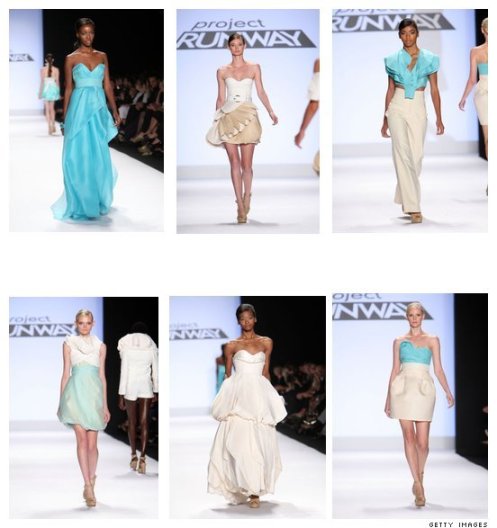
Currently my favourite collection from the Project Runway show is that of the Season 5 Winner, Leanne Marshall’s collection.
Overview

I love how her whole collection is brought together by her usage of folds. Her designs are all elegant and not bound to the runway, something that people could actually wear. One thing I always wondered about runway clothing was that it wasn’t something anyone would wear in real life, so what was it’s worth? However, her designs can actually be worn in real life, maybe mostly for special occasions but none-the-less still wearable.

I particularly like her design of a high waisted pants along with a very interesting top. The top is covered in “petals” and designed in such a way that the whole outfit is made more interesting than the usual top with high waisted bottoms. I like the way she incorporates nature/the sea in her designs with everything being flowy to some extent. Her designs are so special that one look and you would most likely be able to tell it is designed by her. The folds are her trademark, yet she doesn’t not overdo it.

She is able to achieve a nice balance in her design that only makes her clothing more appealing.

Observations of Hands (2008)

•September 28, 2009 • Leave a Comment

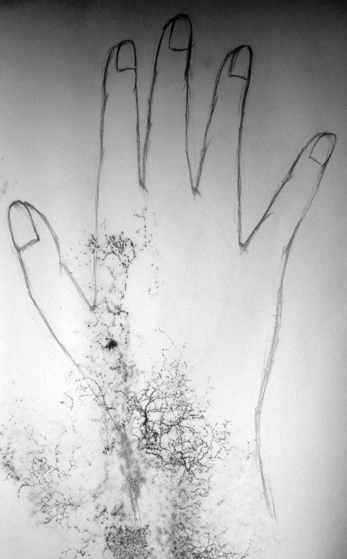
Hand disfigured

This is one of the many of my artworks that had to go through editing in Adobe Photoshop by me before it could be uploaded, because my oh-so-clever maid decided it would be fun to put all my artwork in the storeroom where they somehow collected water and moss.

Name:  Observations of Hands

Year: 2008

Medium: Pencil on Paper/ Watercolour

Well we were given the task to draw some observations of hands for our very own book binding assignment. So here they are. Well I think my proportions have improved somewhat from last year. I kind of feel really happy about them from some reason [other than the fact that they have also been ruined by the water somewhat…] For some of them when I was editing I decided to leave the mossy black thing behind because I thought it was quite interesting to see them there somewhat.

It’s kind of like nature meets man? Rather, nature attacks my artwork but nevermind. The patterns that the black thing formed is actually quite interesting… It’s reminds me of lace somehow. At some parts… some times it’s just a weird streak. I guess that is the interesting thing about it. So now my work is 100% not replicable. =)

I guess it’s a good thing that came out of the bad.

Rating: 3/5

Pencil Drawings (2007)

•September 28, 2009 • Leave a Comment

Pencil Drawing 1

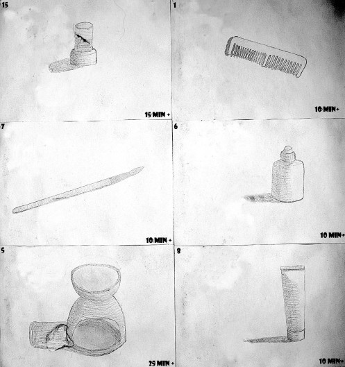
This is one of the many of my artworks that had to go through editing in Adobe Photoshop by me before it could be uploaded, because my oh-so-clever maid decided it would be fun to put all my artwork in the storeroom where they somehow collected water and moss.

Name:  Pencil Drawings

Year: 2007

Medium: Pencil on Paper

This was something like an assignment for us to practice drawing pencil drawings along with improving our abilities to draw in proportion. I chose to do everyday objects as they were the most accessable and easy to find objects.

This pieve of work was meaningful to me because i was able to improve slowly but surely as i practiced more and more with shading and drawing from observation. However, regardless of so, my ability to draw in proportion 100% of the time is still lacking and hence I feel that with more practice, I should be able to do so fairly well in the future.

Practice makes perfect~ [I hope]

Comment from Mr Lim: The drawings are fine, for the time you have allocated. Watch out for the proportion of the object by drawing a faint outline for them before shading. Direction of the shading is important.

Rating: 3.5/5

Inspiration – h.NAOTO

•September 28, 2009 • Leave a Comment

h.NAOTO’s clothing designs are always filled with flamboyant overboard clothes that are filled with a lot of ideas on one outfit. These outfit are filled with so much detail that for most of them, it is difficult to capture the main idea that the designer had wanted to capture. However this contributes to how interesting his elaborate designs are and allows the viewer’s mind to run wild on their own.

For the most of the designs, the base colour would be black or white, with one other colour in different shades to bring the whole outfit together. Although the designs may seem to be so messy to the extent that they can all be taken apart to create a different design all together, it is undoubted that the design that the designer decided to use is probably the most mysterious and brings across the mysteriousness of the genre of clothing itself.

I also like how the designs on the runway start off with only white/cream colours and black before slowly adding more colours resulting in the end addition of bright neon like colours of yellow and hot pink. The designs are also somehow brought together to be seen as a collection through many different ways. For starters, this being the Spring/Summer collection, some of his designs uses ight flowy materials so act similar to that of the bride’s veil, flowing behind her. It can also resemble the spring wind blowing softly behind. The way the model’s walk also play a part in the show.

The models start off walking slowly, like as if to create a sense of suspense, the ending part of the video than shows lively models skipping and waving to the crowd [these are actually not professional models but japanese music idols who were not trained in runway walk] to give the whole thing a more lively feel. This is in conjunction with the addition of brighter colours into the collection.

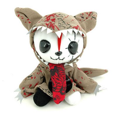
The skippy bunch are also brought together by a toy similar to that of a mascot, the cat. The beginning designs are shown with a figure of a cat printed on the back and the remaining few all carry the stuffed mascot while walking down the runway.

e5ao10000000m7us

I like how the designer uses this mascot to bring the whole collection together and I enjoy the various changes in the whole collection. Each design is special, all of them can be seen as individuals or as a group.

Website: HERE

Inspiration from Lee Kuan Yew’s book covers

•September 28, 2009 • 1 Comment

Bookcover1

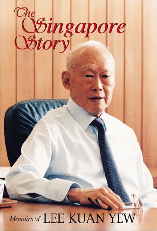
When I was first told to do a book cover for my grandfather, the first thing that came to my mind was the Lee Kuan Yew book covers that I had seen so often at home due to the fact that my parents had bought at least 3 copies of the same book and placed one of them in my room for some reason. Anyway, because my parents used plastic to cover the book, it kept sticking to my other books and falling out. Although frankly I have not read the book to this day, I always find the book covers for his books very interesting.

Although all his book covers are relatively simple, mostly with a single picture of him in the front. I liked how the cover gave him a certain air of superiority and made him look as important as he is. The cover was simple yet did it’s part. It is easy to recognize and the minute a Singaporean looked at it, he or she would immediately go “Oh it’s the Lee Kuan Yew book” regardless or whether he or she actually knew the title itself. This book “The Singapore Story, Memoirs of Lee Kuan Yew” is probably the most well known of his books and it shows Lee in a dress shirt, sitting in a black office chair. Although the picture gives him a superiority, it is contrasted by his gentle looking features, like that of any other grandfather.

I really liked the way the book cover portrayed him and felt that it really is a picture that meant a thousand words.

I wanted my grandfather’s book to be something similar to that. Although my grandfather may not be such an authoritative figure in Singapore, it is undoubted that if my family were Singapore, he would be the knowledgeable Lee Kuan Yew, always passing down more knowledge to his descendants. Although I attempted to try and do something similar for my grandfather’s book, I wasn’t able to do as well as the designers of the Lee Kuan Yew book partially because my grandfather did not have any pictures that were similar in the air of superiority to that of Lee Kuan Yew as his pictures were not professionally taken. and didn’t really have a similar setting.

I ended up using a photo similar to that of a passport sized photo. Hence the product did not turn out as well as I had wanted it to. I think that the glossy effect of the book when it was printed also plays an important part in the whole look of the book, hence I also feel that the book could have been printed in a glossy setting.

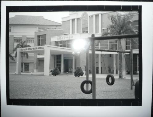
Black and White Photo Assignment (2008)

•September 28, 2009 • Leave a Comment

Black and White

Name:  School life

Year: 2008

Medium: Photo?

Well for this assignment, I wanted to capture something to do with school life. Not to sound lame or anything, but it is a fact that I spend most of my time in school or doing things that have to do with school [like now?] so I decided to capture something to do with school.

Well the first thing that comes to my mind is actually the school name. Most likely because of how seriously my parent’s takes a school’s name. For them it’s all Raffles and Nanyang only, others not so good to go to. Though I personally am quite open to going to any school, my parents obviously aren’t so yup, when I first thought about my own school, I thought about it’s name.

There’s actually a deeper meaning to my photo. I wanted to use the swings to give it more meaning, then just a photo for an assignment. I wanted to use the swings to show that school can actually be fun, but because of various reasons, nobody can actually find any fun in it. I actually wanted to use this to point out to parents that putting so much stress on your children would actually only have the opposite effect.

Though I think hardly anybody can tell that this was was what I wanted to say from this picture…

Marks: 63/90

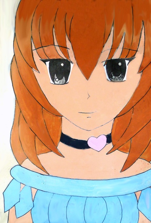
Manga Drawing/Colouring (2007)

•September 28, 2009 • Leave a Comment

Girl

This is one of the many of my artworks that had to go through editing in Adobe Photoshop by me before it could be uploaded, because my oh-so-clever maid decided it would be fun to put all my artwork in the storeroom where they somehow collected water and moss.

Name: Manga Drawing/Colouring

Year: 2007

Medium: Ink/Poster paint

At that time, I was really interested in manga and anime, along side my sister who would draw “chibis”.  The dress design was actually done by my sister, but I did the rest. For my first drawing and painting of a manga character, I think I did pretty well although I do have one complaint about the neck of the drawing… It looks weird or funny in a sense. I think it’s because the neck is too long?

Oh, one other thing is that the drawing lacks shading, so it looks really flat to me. Maybe that’s why the neck looks weird.

Could have done better on the shading, on the other hand, I think my manga drawing was better then… I lack practice.

Rating: 3/5

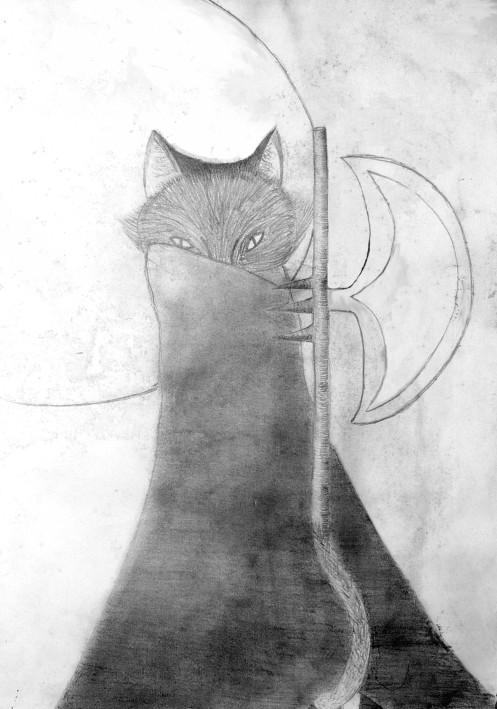
Charcoal Drawing (2006)

•September 28, 2009 • Leave a Comment

Charcoal Drawing

This is one of the many of my artworks that had to go through editing in Adobe Photoshop by me before it could be uploaded, because my oh-so-clever maid decided it would be fun to put all my artwork in the storeroom where they somehow collected water and moss.

Name: Charcoal Drawing

Year: 2006

Medium: Charcoal

We were trying out different mediums during class time and one of the mediums was charcoal. I decided to draw a cat [from the influence of cat lover, Hui Ci] and I wanted to draw something that looked a little dark-ish and eerie? But failed to.

On overall I think the propotions were quite okay. And I quite like the idea of putting the moon in the background to try to add to the eerieness. Charcoal for me was pretty hard to handle though, so my shadings for the coat worn by the cat went a little haywire and looks a little funny… But pretty good attempt for a first time at charcoal drawings [not something I’d like to do again though. Too messy]

Rating: 4/5

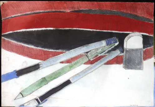
Pen and Wash Drawing (2006)

•September 28, 2009 • Leave a Comment

Pen and Wash

Name: Pen and Wash Drawing

Year: 2006

Medium: Watercolour and Ink on Paper

The first time doing watercolour and we were told to do a drawing on pens. so I decided to draw my pencil case and eraser along with it. Since just drawing a pen would be boring.

I think my drawing was pretty okay, other than the weird eraser. My proportions till now still have problems so I don’t really know how to fix it…

I had absolutely no idea how to use watercolour, so I basically just used it like poster paint for the pencil case which i painted first. Then tried to do washes. and failed. But I think on overall for someone like me it was a pretty good attempt?

This is also one of the many of my artworks that had to go through editing in Adobe Photoshop by me before it could be uploaded, because my oh-so-clever maid decided it would be fun to put all my artwork in the storeroom where they somehow collected water and moss.

Comments from Mr Lim: Something interesting in the top pen. The gel has an interesting bleed look. The eraser’s proportion is problematic. Control your water-colour washes a little more.

Marks: 21/30

The Unusual (2006)

•September 28, 2009 • Leave a Comment

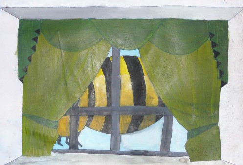
The Bee

Name: Surrealism Assignment

Year: 2006

Medium: Poster Paint on Paper [I think]

One of my first paintings when in AEP if I’m not wrong… We were told to do a surreal painting and i randomly decided to do a bee outside my own house. So the painting is actually of a window… Although maybe because of my house’s curtains it may look a bit like that of the stage curtains. I should have used a ruler or something straight to draw those lines because currently to me they all weird and fat and thin and fat and thin… well at least it shows that I have improved somewhat if you compare my current drawings to this… This looks really child like actually. Like that of a primary school student… The shading was quite okay for a first attempt, although I think it was mostly done by Mr Lim…

This is one of the many of my artworks that had to go through editing in Adobe Photoshop by me before it could be uploaded, because my oh-so-clever maid decided it would be fun to put all my artwork in the storeroom where they somehow collected water and moss.

Comment from Mr Lim: Simple but effective. You could have studied a real bee for next time. Is this a stage or a window? It would have been more successfully surreal if it were a stage (like Siew May Auditorium)

Marks: 60/75